
Latitude — Digital Experience & Wayfinding Design
Designing a cohesive wayfinding and environmental system that improves navigation, orientation, and spatial clarity across the user experience.
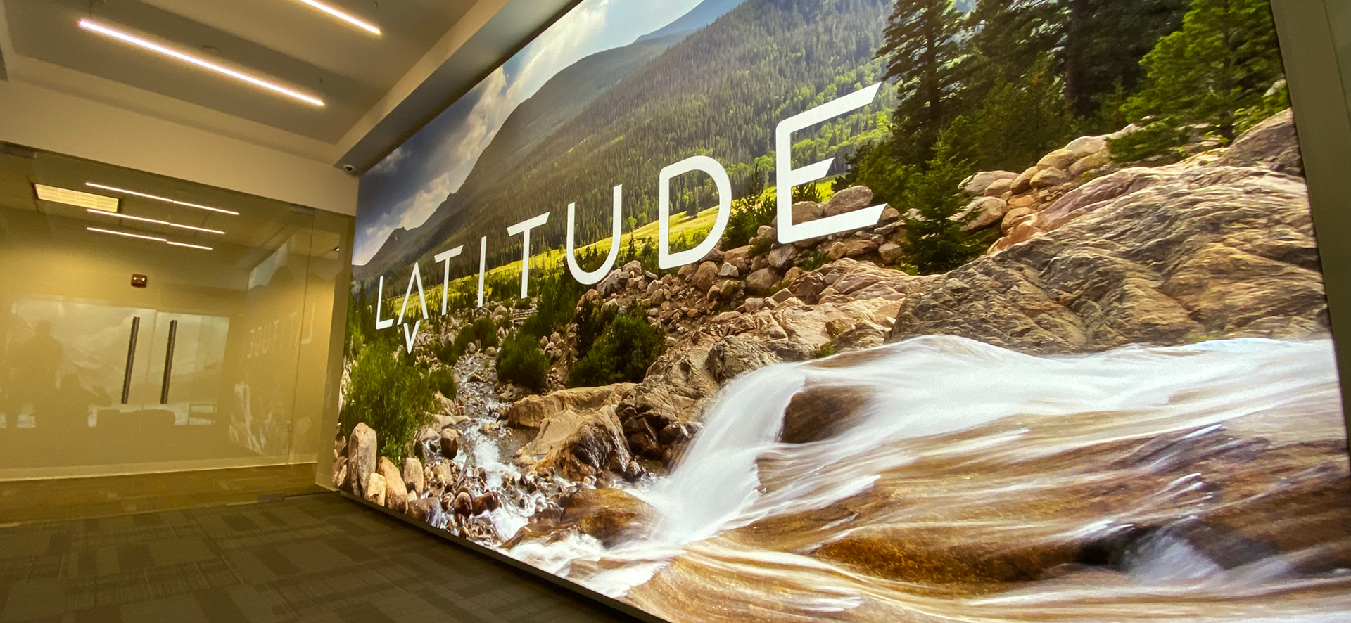
Wall Wrap
Overview
This project focused on designing a wayfinding and environmental graphics system for LATITUDE, with the goal of improving how users navigate and interact within a physical space. The work required creating a cohesive visual system that balanced functionality, spatial awareness, and brand consistency while ensuring users could move through the environment intuitively and efficiently.
Role
Wayfinding
Storyboarding
UI Design
Large Format Print Design
Storyboarding
UI Design
Large Format Print Design
Video Screen Loop
Challenge
The existing environment lacked a clear and unified navigation system, making it difficult for users to orient themselves and move confidently throughout the space. Inconsistent signage, fragmented visual cues, and unclear hierarchy created friction in the user journey and reduced the overall effectiveness of the environment.
The challenge was not only improving navigation, but also creating a cohesive environmental experience that integrated seamlessly with the broader visual identity of the space.
Objective
The objective was to design a scalable wayfinding system that improved orientation, readability, and navigation throughout the environment while reinforcing a cohesive visual identity. The system needed to function clearly across multiple spatial touchpoints while maintaining consistency in hierarchy, typography, and visual communication.
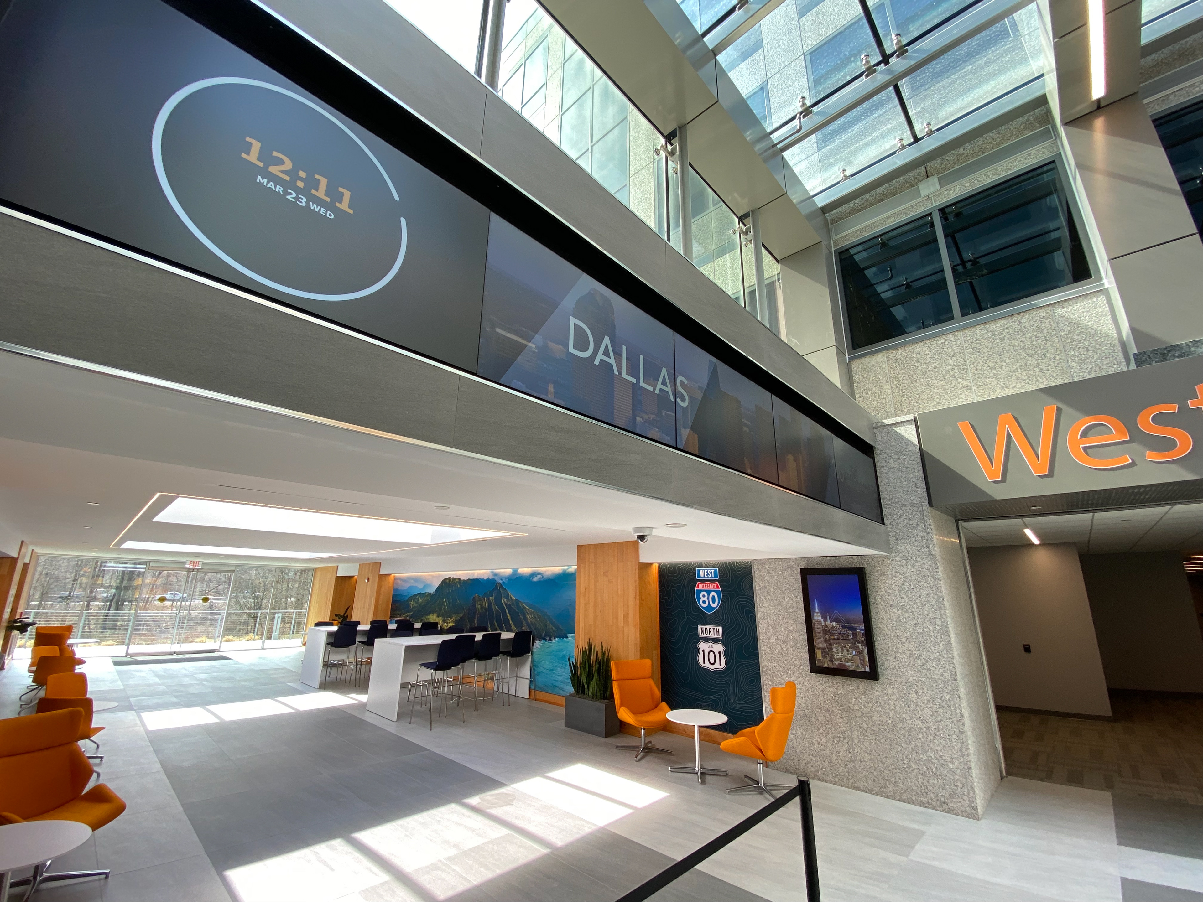
Information Screens in Hallway

Information Screens in Lobby
Constraints
This project required designing within the constraints of a physical environment where visibility, readability, and spatial context were critical. Signage needed to remain legible from varying distances and viewing angles while supporting fast comprehension in motion.
Additionally, the system needed to scale across multiple applications, including directional signage, identification systems, environmental graphics, and branded touchpoints, while maintaining visual consistency throughout the experience. The design also needed to balance functional clarity with a refined aesthetic approach that aligned with the overall identity of the environment.
Approach
The approach began with establishing a foundational hierarchy system focused on improving orientation and navigation throughout the space. Signage structures, typography systems, and directional patterns were developed to create clear visual relationships between destinations and pathways.
A consistent environmental graphics system was then introduced to unify all touchpoints across the experience. Typography, iconography, spacing, and placement were intentionally designed to improve readability and support intuitive navigation while reinforcing the visual identity of the environment.
Art direction played a key role in ensuring the system felt cohesive and intentional rather than purely utilitarian. Visual elements were treated as functional components of the user experience, helping guide movement, reinforce hierarchy, and create a more engaging spatial experience throughout the environment.
Particular attention was given to balancing simplicity with scalability. The system needed to remain highly legible and intuitive while being flexible enough to accommodate multiple signage types and evolving environmental needs.
Key Decisions
One of the primary design decisions involved prioritizing readability and orientation over decorative visual treatment. Because users interact with wayfinding systems while moving through physical space, clarity and immediate comprehension were treated as the foundation of the experience.
Another important decision involved creating a modular system that could scale across different signage formats and environmental applications while maintaining consistency. This ensured that the experience remained cohesive regardless of location or touchpoint.
Additionally, art direction was integrated directly into the navigation system rather than applied separately as surface-level branding. Visual decisions were made intentionally to support movement, hierarchy, and user understanding throughout the environment.
Outcome
The final result was a cohesive wayfinding and environmental design system that improved navigation, orientation, and overall spatial clarity throughout the experience. The refined visual system created stronger consistency across environmental touchpoints while supporting a more intuitive and engaging user journey. The project demonstrates the ability to design structured systems that balance usability, scalability, and visual design within physical environments.
Interactive Screen Saver

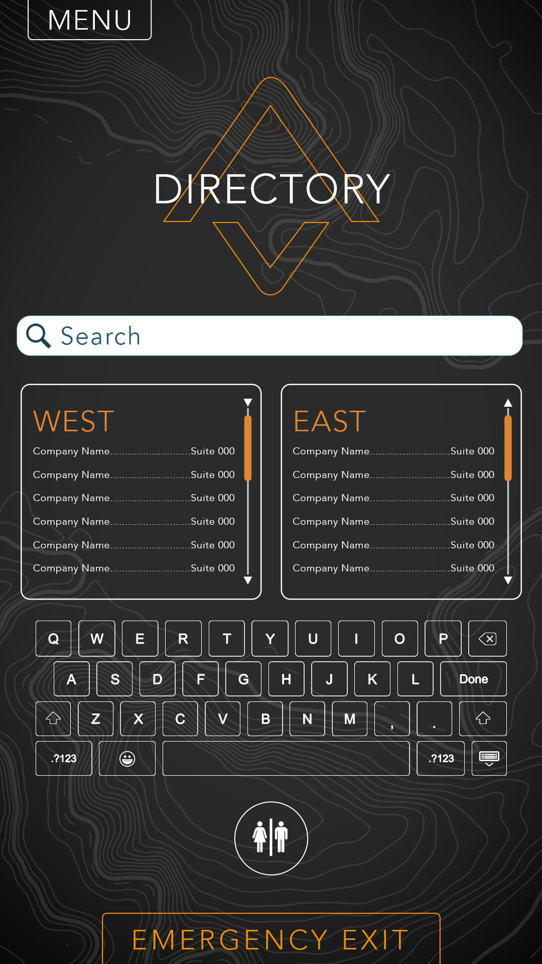
Demonstration
This project highlights the ability to design scalable environmental systems that improve navigation and user orientation within complex spaces. It demonstrates strength in information hierarchy, environmental graphics, typography systems, and art direction, while reinforcing an ability to create cohesive experiences that merge functional usability with strong visual execution.
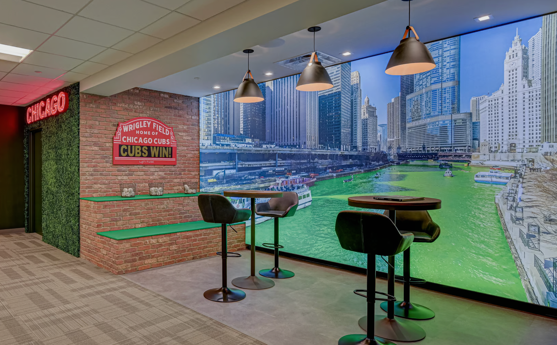
Chicago Huddle Room

Hawaii Huddle Room

New York Huddle Room

Denver Huddle Room


